What is a Color Frame?
A Color Frame is a way to break down and visualize the colors in a single image, providing a unique, detailed look at its color composition. By showing both dominant and average colors, a Color Frame highlights the visual essence of a scene.
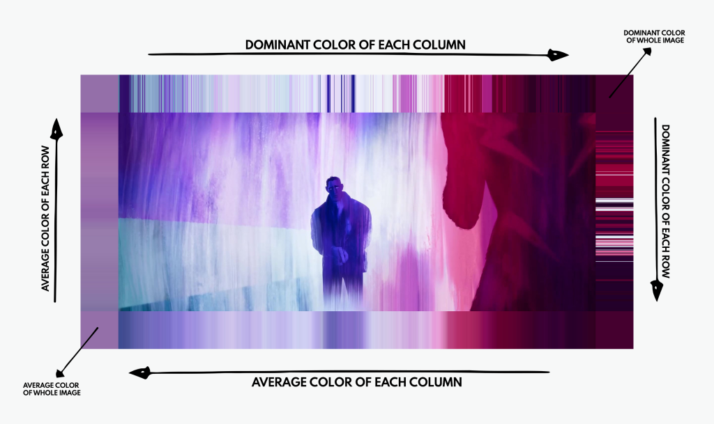
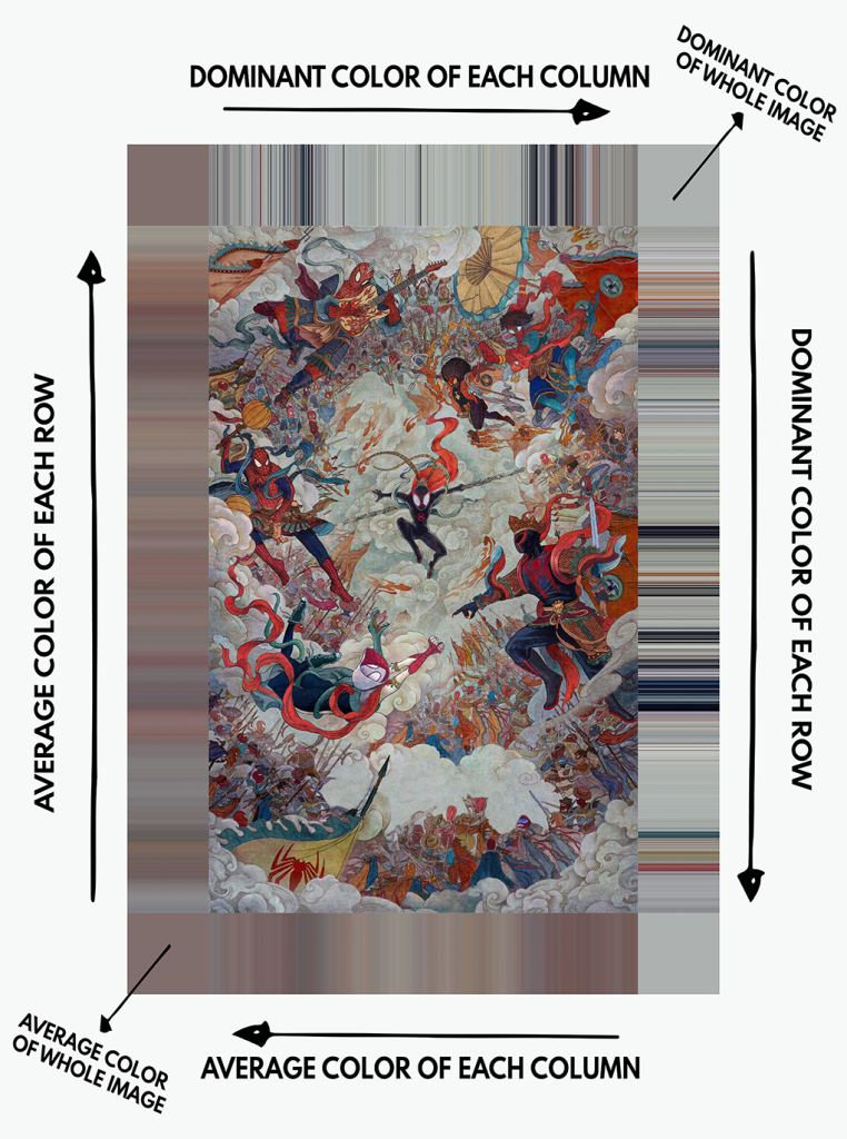
Here’s how it works:
-
Top border: Shows the dominant color of each column (1px wide).
-
Right border: Shows the dominant color of each row (1px tall).
-
Bottom border: Shows the average color of each column (1px wide).
-
Left border: Shows the average color of each row (1px tall).
-
Corner squares: The top left and bottom left squares show the average color of the entire image, while the top right and bottom right squares display the dominant color of the whole image.
The result? A colorful, frame-like border that summarizes the standout hues of a movie scene or image. You might find it similar to Movie Barcodes, which compress entire films into stripes of color. But unlike Movie Barcodes, which provide an overview of a movie’s color palette, a Color Frame dives deep into the details of a specific moment.
What’s the Point of a Color Frame?
Honestly, it’s just cool. I wanted a way to explore the color palette of a film shot or poster, and the Color Frame does exactly that. It captures the essence of an image by focusing on its dominant and average colors, giving you a quick insight into the mood and atmosphere.
Beyond the cool factor, a Color Frame is also a just another way to appreciate the artistry behind filmmaking, which is ultimately why I created Color of Cinema in the first place. Colors play a huge role in shaping how we experience movies, and Color Frames are a fun way to visually appreciate that artistry. They’re kind of like Movie Barcodes, but instead of summarizing an entire film, they focus on examining the colors of one specific frame.
It’s a simple yet insightful tool for anyone curious about how color influences storytelling or for those who just love admiring cinematic visuals. Whether you’re an artist, a filmmaker, or just a film fan, a Color Frame offers a new perspective on your favorite scenes.
The Limitations of Color Frames
While Color Frames are great for showcasing dominant and average colors throughout the image, they do have a limitation: some colors in the frame can be overlooked due to being less prominent. This is because the focus is on the most visually dominant colors, which can sometimes overshadow subtler colors that still contribute to the overall atmosphere. As a result, the full range of colors in an image won’t be fully represented, especially those that play a more nuanced role in the image’s composition.
To address this, every Color Frame on the website and on our social media is accompanied by a variant of the Color Frame that displays the image’s 38 most dominant colors. This alternate Color Frame provides a more comprehensive representation of the image’s color palette. Both Color Frames work in tandem to give you a more complete sense of the image’s overall palette and atmosphere.
Swipe across on the Color Frame below to see for yourself.
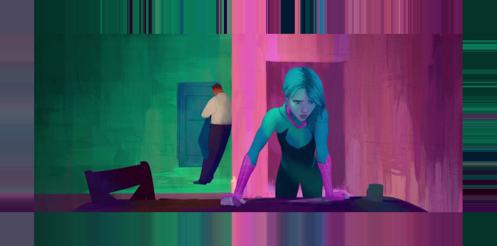
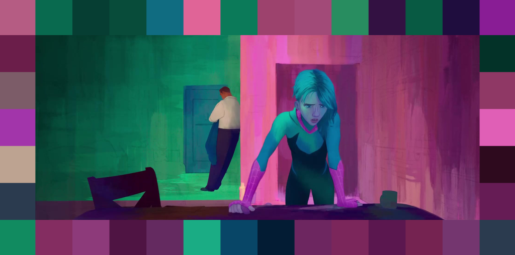
Color Frames from Spider-Man: Across the Spider-Verse
A Color Frame isn’t just about analyzing colors; it’s about enjoying them. It’s a unique way to see and appreciate the visuals of your favorite films, TV shows, and posters. I hope you enjoy exploring them as much as I do!